A Better Way: Bootstrap
05 Oct 2023Raw HTML and CSS
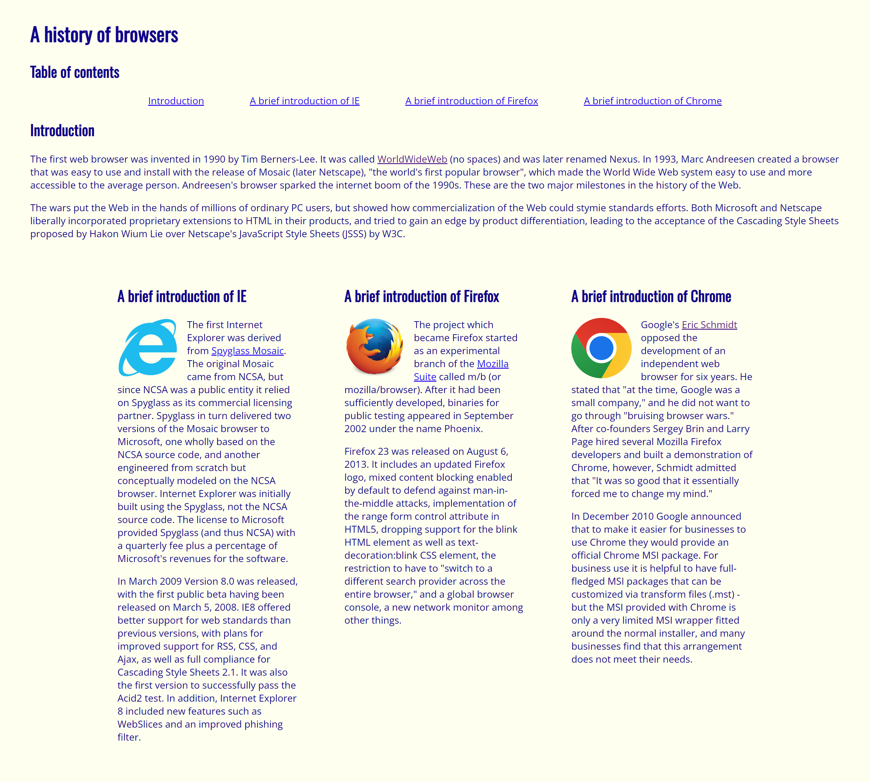
When I worked with HTML and CSS for the first time in ICS 314, I was underwhelmed by the result. It was a lot of work for a really ugly product.
Maybe it's the color combination and the blue hyperlinks, but it looks like an early 2000's website that can and will steal my personal information at the first chance it gets. What scares me more than that is how much work I put into it for it to come out looking like that. I asked myself, how was I ever going to make a beautiful UI if I was struggling to make an ugly one?

What makes UI Frameworks so useful?
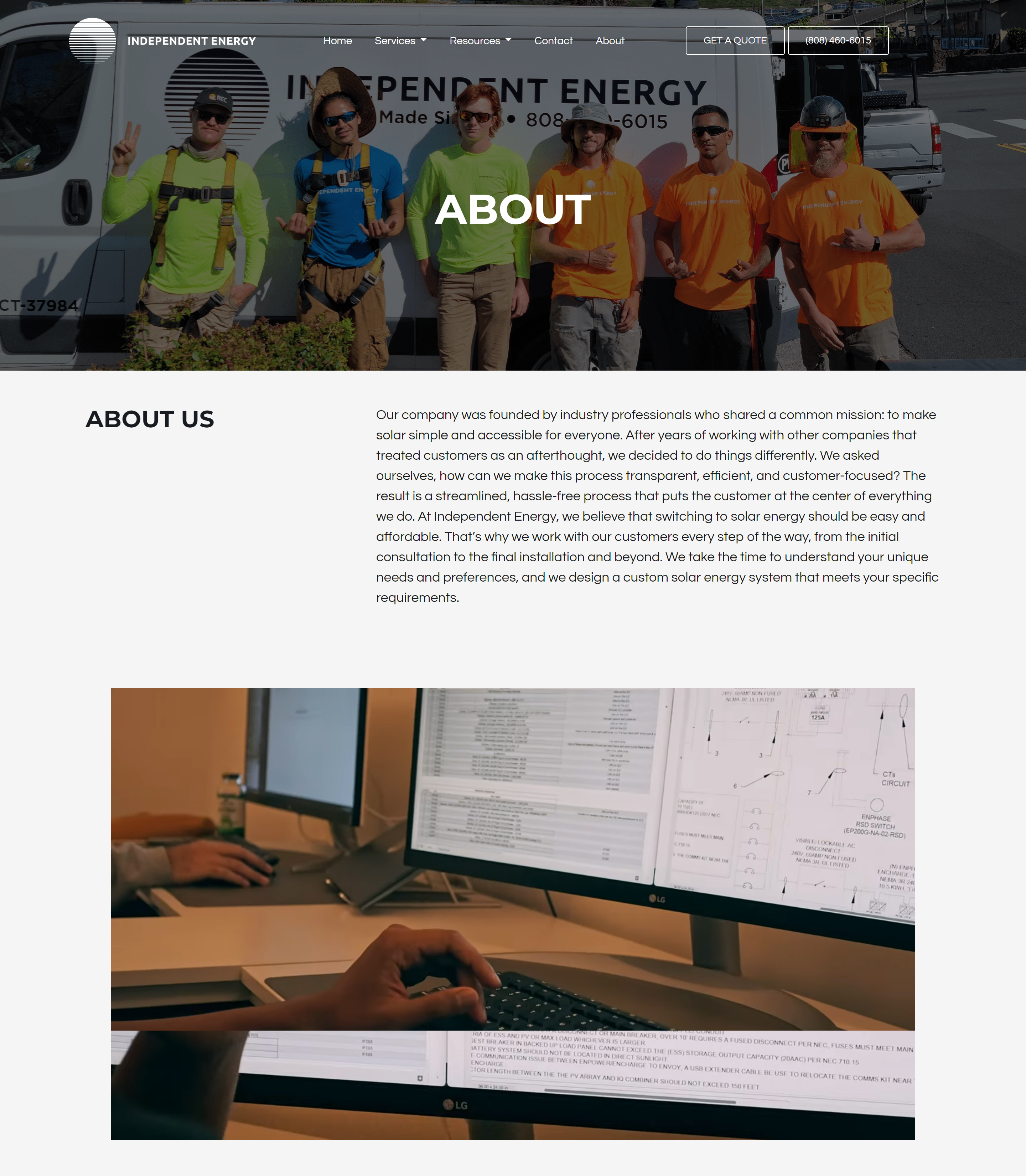
In ICS 314, the UI Framework we used is Bootstrap. Bootstrap has a grid system that allows us to create responsive rows and columns. For my purposes, it has been an absolute game changer, turning what would have been a 20 minute fight with CSS to create columns into a trivial task. It has allowed me to create clean, modern-looking UIs, such as this recreation of Independent Energy's old About page!

However, Bootstrap is not just the grid system—it's the buttons, the navigation bar, the background images and the embedded video, too. Because Bootstrap is a collection of CSS classes, it makes building a visually appealing UI so much easier.
For this website recreation assignment, I custom made the buttons, though I really didn't have to. I wanted the button to look accurate to the actual website, though Bootstrap's btn-outline-light class would have made a really nice, similar looking button. No ugly, early 2000's raw HTML and CSS buttons to be found!
Though these pre-made classes for stylized elements are great, I have to emphasize that the best thing about Bootstrap is undoubtedly the grid system. It is not difficult to learn, and learning it pays off fast. I don't think I can ever go back to raw HTML and CSS knowing that I won't have Bootstrap's intuitive grid system in my tool belt.
Bootstrap is for everything
Before Bootstrap, my technical essays were plainly formatted and lacked pictures. I worried that any styling I attempted would inhibit the flow of the essay. An image would be a monolith amidst a sea of text, ugly and in the way. Now, writing this essay, I knew I wanted to include images that would relate to the text beside it. Since the images are taller than they are wide, I knew that if I didn't do some special formatting, it would be a monolith. So, immediately, I added Bootstrap's script tags and started arranging things to my liking.
And after all that, I can confidently say this is a decently visually appealing essay! At the very least, it's more appealing than a wall of text. Bootstrap's utility is not just confined to crafting visually pleasing websites—it extends to improving the presentation of technical content, such as this essay. Its flexibility allows for the seamless integration of images, buttons, carousels, forms, and more.
As I reflect on the difference between using raw HTML/CSS and Bootstrap's framework, I realize that Bootstrap is really a tool that allows creators to communicate their design ideas more effectively and more efficiently. Whether it's building a modern website or formatting a technical essay (like this one!), Bootstrap has become an indispensable part of my toolkit, revolutionizing the way I approach design and presentation in the digital realm.