Manoa Exchange
Overview
For ICS 314, Software Engineering I, our final project was to create a web application with our group to solve a "problem" that we have as UH Manoa Students. We used the Meteor framework and MongoDB for our database. My wonderful teammates were Richard Baltazar, Lauren Clayton, Josiah Kila, and Kayla-Marie Torres.
The Problem
At UH Manoa, there are many students that want to study abroad in another country, regardless of whether they are a language major—heck, even I wanted to study abroad in Japan! However, not everyone has a good, well-rounded understanding of the place they want to go. Will it be a good fit for them? Would it benefit them? Is the grass really greener on the other side? There is no good way for prospective, current, and former study abroad students to freely communicate and share their hopes and experiences.Our Solution
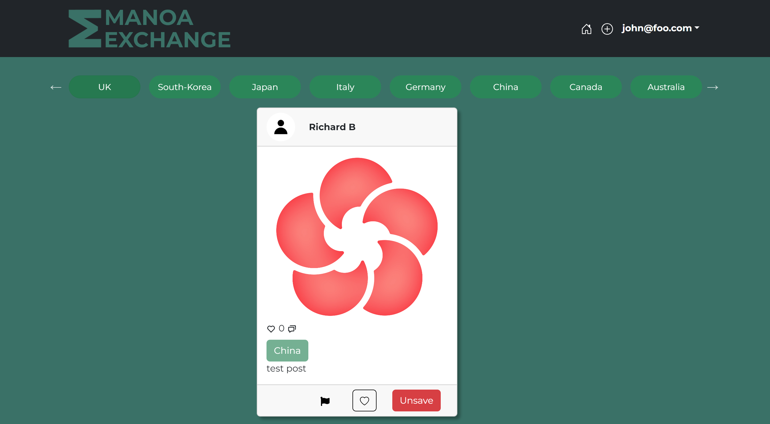
We created a social networking site tailored to giving and getting information on study abroad, called Manoa Exchange! Once you register, you will be able to:
- View other users posts
- Sort posts by country using tags
- Create posts with images and captions
- Like and comment on posts
- Save and un-save posts
- Report posts which are inappropriate
- Customize your profile information and avatar
Admins have the extra capability of reviewing and deleting posts which have been reported.


My Contributions
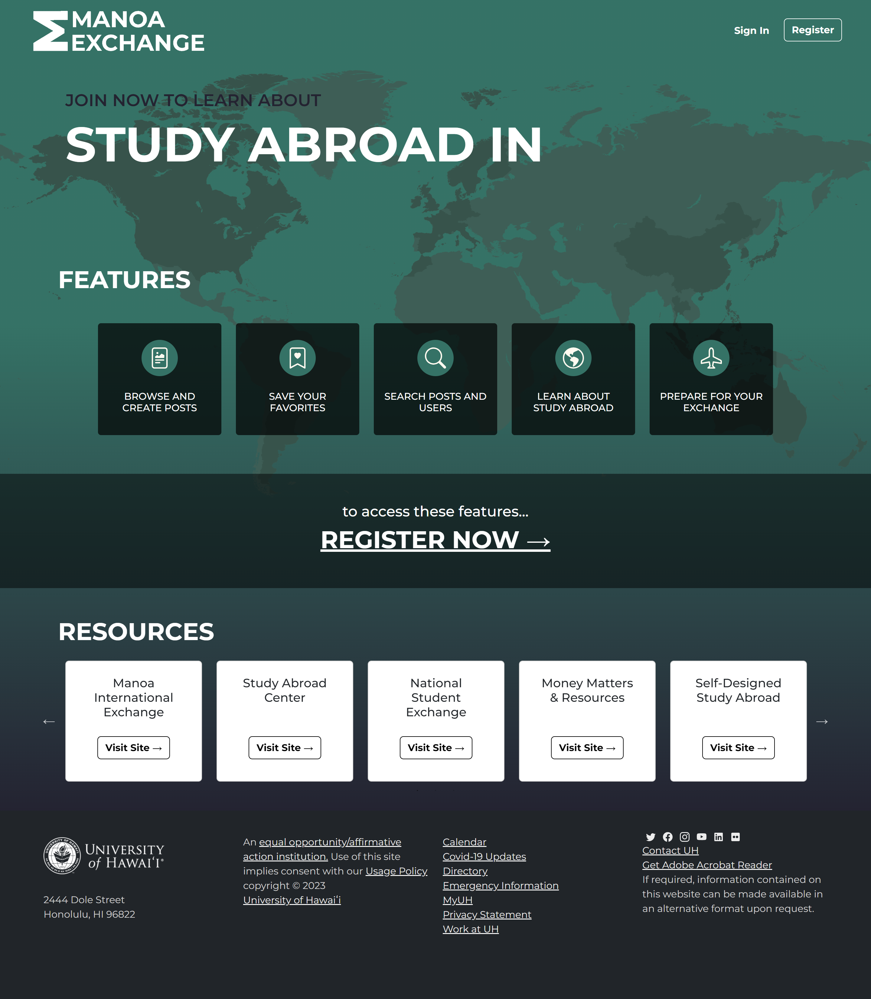
I was in charge of creating the landing page, implementing the tags and tag carousel on the home page, and some other CSS. I also worked with the TestCafe testing framework to create tests that would automatically run every time an issue was committed. Finally, I was responsible for configuring the Meteor Up files and deploying the webapp with Digital Ocean.
What I Learned
With this project, I have gained a better understanding of web design and practiced CSS to death. It was not just about putting things on the page and changing the colors—it started to become more focused on seriously considering the user experience and how to make the website consumable and accessible. I started having to think about how it would look on mobile, and while I wasn't completely successful, I believe it's passable on a smaller screen.
Not only that, but I was able to improve my troubleshooting skills as I worked with the TestCafe tests. Watching them fail over and over pointed to problems in our application which I went in and fixed. Besides what I was tasked to do, I also helped around where necessary and troubleshooted a lot—my ability to read errors has improved significantly.
Conclusion
My biggest takeaway from this project has been the agile project management aspect. It has been a while since I've worked in a team on a significant project, and I have to say, it's been a wonderful experience. I enjoyed the issue driven style and found it easy to manage the project with the help of the GitHub project board.
If I were ever to come back and work on this project again in the future, I'd make some changes, such as make the tags searchable in a search bar rather than by tags, making the post cards bigger, and adding more features such as direct messaging. Additionally, I would have liked to put more focus on the mobile appearance of the app. If I ever create a webapp again, I will be sure to consider mobile users more.